It’s time we take off our rose-coloured glasses and look at pink in a fresh new way.
People were once aghast at the idea of decorating with pink, fearing it was either too Pepto-abysmal or overtly frilly-pony-princess-bedroom to be used in a large living space. That’s no longer the case!
Thanks to First Light, Benjamin Moore’s Colour of the Year 2020, pink has been revitalized as a real trendsetter. As the colour de jour, it’s bringing a rosy, warm glow to our homes while re-introducing pink as exciting and on trend. Here’s just a few highlights from Benjamin Moore’s pink palette:

Featured colours(top row, left to right): Rose Lace 1254, Burgundy Rose 1280, Secret Garden 1284, and Pleasant Pink 2094-60
Featured colours(bottom row, left to right):First Light 2101-70, Unspoken Love 1269, and Modern Romance CSP-435
I would even go so far as to call the new pink a neutral. We usually think of neutral shades like white, beige and grey as “nice” colours content to take a backseat while their bolder, splashier counterparts lead the more interesting design conversation. Today’s petal-powered pink is no wallflower! It’s a refreshing alternative to more traditional neutrals, but like them, pink can create a very calming space and works well as a blank canvas that complements and elevates other colours like:
-

Pink + Navy
-

Pink + Black or Charcoal
-

Pink + White
-

Pink + Emerald Green
Playful Accessories
If you want to flirt with pink in your home but are feeling shy about an all-in commitment, start slow by bringing in pink elements one at a time. Adding a few playful accessories will allow you to try out pink in different spots or easily swap pieces in and out of spaces.

Featured products (from left to right): Pink furry throw pillow; Marshall’s,Three-tone decorative vases; Bouclair, Textured throw pillow: Bouclair
Pink Paired with Metallic Finishes
Pink sparkles when paired with the shine of metallic finishes. Try a pop of pink on the wall or choose an accent piece of furniture that has elements of gold or silver.

Featured products (from left to right):Side chair with ottoman; Bouclair, Wall clock; Structube
Artwork
Kick off your pink colour story with artwork. Designers will often use a piece of art as the springboard to developing the palette of an entire room.
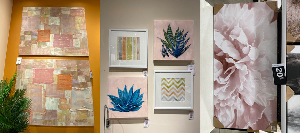
Featured Products:Wall art: Structube,Wall art: Structube, Wall art: Bouclair
Layered & Mixed
By the way, it’s perfectly fine to layer and mix different shades of pink in one shared space. It gives a room depth instead of looking one-dimensional – and there really is no way to do it wrong.

Featured Products: Pink accents in various sizes and textures: Urban Barn
Can you overdo it with pink? Oh sure, but you can say that about any colour. By incorporating this trend in small doses, you’ll avoid a design faux pas while transforming your space into one that is on point and definitely in the pink.
Sudbury, where should I go next? If you have ideas of places I can find interior design inspiration and do some trendspotting, please let me know by leaving comment below.