Your Cart is Empty


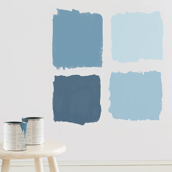
You fell in love with a paint chip. Hey, it happens. But as enamoured as you may be with that particular shade of awesome, how appealing will that colour be when it’s painted on a wall, fills an entire room or covers the outside of your house? Luckily, before you invest in an entire can of paint, there are ways to test out your love to see if it’s real – and if that love will last.
Isolate Your Colour Choice
A colour card will have a number of similar but different colour options on it. Avoid the temptation to hold them up and evaluate them at once. Instead, isolate the one colour you are considering (either by concealing the others or cutting it out). Viewing only one colour at a time will give you a more authentic feel for the bigger picture: how it will look once applied.
Stop! Don't Paint Your Sample on the Wall
Always try paint samples in your space before deciding on a colour. However, consider not painting your sample directly on the wall. The existing paint can affect or alter the accuracy of the new paint’s true colour. Instead, paint a poster board with two coats of your sample. This way, you can tote it around day or night and see how it will look amidst your home furnishings in all types of light.
Light Switching
Light is never consistent; it varies by time of day, season and even the weather outside. Of course, paint colour will look different depending on the type of light it is exposed to, which is why samples should be examined in both natural (daylight) and artificial (evening) lighting. This is especially important when choosing interior paint as some colours will take on dramatically different appearances in different light.
Northern Exposure
Consider where sunlight comes into the room you are painting: does the window face north, south, east or west? North-facing rooms get less direct sun and are cooler so you may want to choose a warmer colour. South-facing rooms may benefit from a cooler hue while east-facing rooms need a warmer palette to offset a lack of natural light in the afternoon and evening. West-facing rooms get a warm glow in the evening so a cooler colour will help tone down the light.
A Lightbulb Moment
The lightbulbs you use around the house can also influence the way colours look. LED bulbs look good with most paint colours. Incandescent bulbs give off a warmer light that enhances reds, yellows and oranges while florescent bulbs have a cooler glow that enhances blues and greens. Halogen light most closely resembles daylight, so colours stand out more.
Multiply the Intensity
It’s important to remember that any colour will look more intense over large surface area than it is on a paint chip or colour card. A bright yellow paint sample might inspire you, but painting an entire room that colour may require wearing sunglasses! The faint of heart or less courageous may want to lean toward more neutral colours when painting a room all one colour, or save the bold choice for an accent colour instead.
Shop Benjamin Moore paint colour samples on our online store, or visit us in-store!


For 50 years, Benjamin Moore's Historical Colour Collection has brought the character of 18th- and 19th-century design into modern homes. From the quiet confidence of Stonington Gray to the bold statement of Heritage Red, these are the shades that never go out of style. Take a look back at where the collection began, and discover the ten colours still shaping homes today.


Discover Swiss Coffee OC‑45 from the Benjamin Moore Colour Trends 2026 palette. Known for its subtle warmth and versatility, Swiss Coffee brings a soft, inviting glow to interiors without feeling stark or sterile. Learn pairing ideas, similar colours, and expert guidance from Barrydowne Paint, your trusted Benjamin Moore dealer in Sudbury.


Explore Narragansett Green HC‑157 from the Benjamin Moore Colour Trends 2026 palette. Known for a richly saturated, deep green with a blackened, moody undertone. Discover pairing ideas, similar shades, and expert guidance from Barrydowne Paint, your local Benjamin Moore dealer in Sudbury.