I Pink I Love You: 9 Colours We Heart For Valentine’s Day & Beyond
February 01, 20232 min read
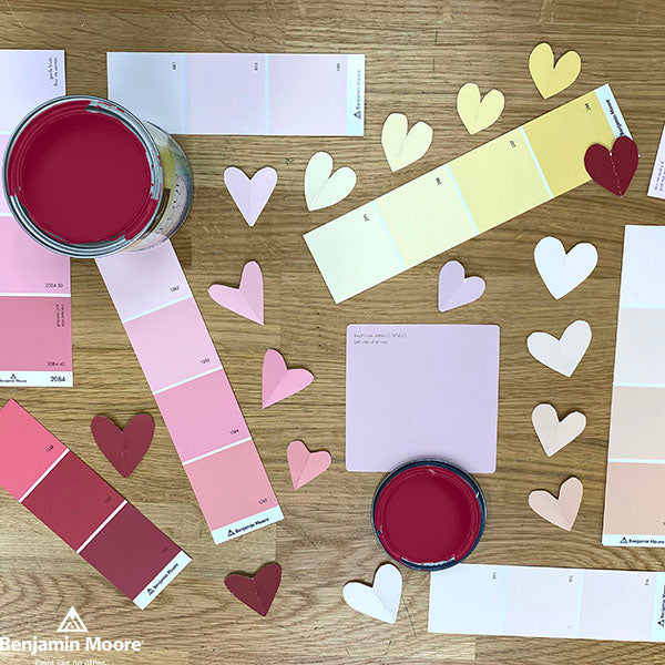
It doesn’t take an arrow-slinging cherub to know that heartfelt reds and crush-worthy pinks play a big part in Valentine’s Day. But beyond the annual holiday of love and friendship, this romantic palette can help create a certain mood in a space and convey emotion the other 364 days of the year too.
First Light made some of us go all heart-eyes emoji. Others just haven’t felt the love for First Light’s particular shade of pink and would prefer to… ahem, explore other options.Either way, our in-store paint experts are here to help with design ideas, colour matching and tips on choosing the perfect palette to make every day feel like Valentine’s Day.
So, let’s put two heart-shaped hands together for these unabashedly romantic paint colours:
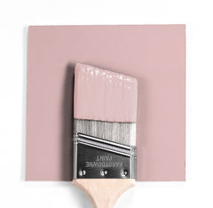
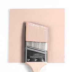
I Love You Pink 2077-70: Soft as a wish and sweet as a parting kiss, this pink pairs beautifully with compatible suitors like grey, green and gold.
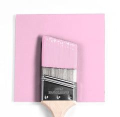
Valentine’s Day 2077-60: This confection-laced pink reminds us of candy conversation hearts without the limited vocabulary. Crazy 4 U? Be Mine.
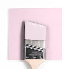
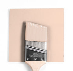
Kept Love Letters CSP-425: We’re hopelessly devoted to this dusty rose, which is right on trend while giving any room a sentimental glow.
Love Always 896: This lovely pearl pink is part of the Classic Collection with good reason. It’s as timeless as it is endearing. Oui, toujours l’amour.
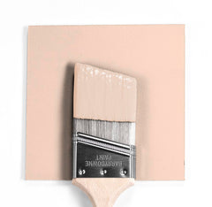
Love Story 1213: Write your own happily-ever-after ending with this apricot blush, perfect for a pastel palette in a delicate powder room, luxurious bath or master suite.
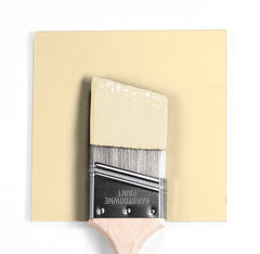
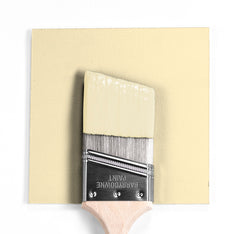
Old World Romance 303: Smooth and creamy, this softly-shaded yellow is like the warmth of the sun on an idyllic romantic getaway.
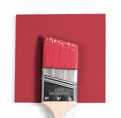
My Valentine 1330: All you need is love… and this velvety-rich raspberry hue. Red evokes emotion and this passionate choice will surely set a few smoldering hearts alight.
Love and Happiness 1191: This pink champagne colour bubbles with good vibes. Not too bright, it whispers softly like the refrain from a favourite love song.
Candlelit Dinner 295: Excuse us while we slip into something more comfortable, like this satiny pink with undertones of seduction. Check, please.
Discover Swiss Coffee OC‑45 from the Benjamin Moore Colour Trends 2026 palette. Known for its subtle warmth and versatility, Swiss Coffee brings a soft, inviting glow to interiors without feeling stark or sterile. Learn pairing ideas, similar colours, and expert guidance from Barrydowne Paint, your trusted Benjamin Moore dealer in Sudbury.
Explore Narragansett Green HC‑157 from the Benjamin Moore Colour Trends 2026 palette. Known for a richly saturated, deep green with a blackened, moody undertone. Discover pairing ideas, similar shades, and expert guidance from Barrydowne Paint, your local Benjamin Moore dealer in Sudbury.
Every year, we get a front-row seat to how Sudbury transforms its homes. With the crisp versatility of warm whites and a touch of trendsetting, 2025 was a year defined by comfort and confidence. Find out what colours dominated the leaderboards, and how Sudbury shows its personality. Dive into our 2025 Wrapped to see the top five colours, the most-painted rooms, and the "comeback" shades that defined our community this year.